Ever Wondered How Big Or Small Places Represented On Maps Are In Reality?
Well, one person who set our to address this, in what he calls Immappancy (meaning insufficient geographical knowledge), is software and graphical user interface designer, Kai Krause.
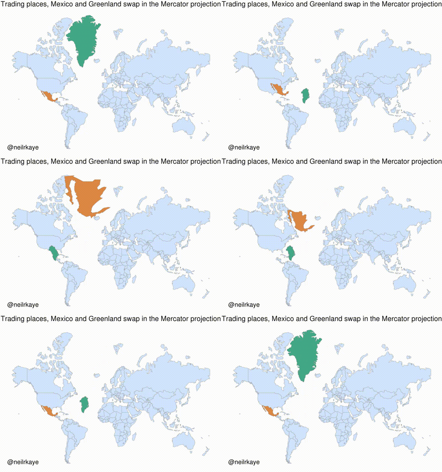
In his contribution, climate data scientist Neil R Kaye, designed a gif of the map below; this link takes us to where further information can be found

The two maps below are static images of the Mercator and the proportional / actual size projections of the map of the world
“Visually speaking, Canada and Russia appear to take up approximately 25% of the Earth’s landmass, when in reality they occupy a mere 5%. When Antarctica is excluded (as it often is), Canada and Russia’s visual share of landmass jumps to about 40%.
Canada is the second largest country in the world, but not by much. Here is an “at scale” look at Canada, the United States, and Mexico.” Nick Routley


Finally, for now, below is how Neil Kaye further demonstrated what we can describe as ‘map projection anomaly’ by digitally swapping Mexico with Greenland in the Mercator projection

No comments:
Post a Comment